The NDA on discussing the features in the soon-to-be-released AutoCAD® Architecture 2011 has been lifted, and once again I find myself very busy (a good thing!). I will try to summarize the new features and improvements in this post, with the hope that I will find some time to put together some future posts with more detail (and screen captures) on some of the significant items.
User Interface
The good news (for some) is that there are no radical changes to the User Interface in 2011. There are some tweaks to the ribbons and the panels and tools thereon (to support added features, add user-requested editing tools to contextual ribbon tabs, etc.), but the basic setup remains as it was in 2010. Toolbars and pull-down menus have not been restored to the out-of-the-box CUIX files (other than the Express Tools pulldown, if you install the Express Tools).
One nice addition is that the View Cube is now available in 2D Wireframe. One consequence of that is that the grid in 2D Wireframe is now like the grids in the other visual styles – a grid of lines, rather than the old dots. I found the grid change somewhat annoying, but like having the View Cube available in 2D Wireframe, so I am willing to live with the grid (which I have generally turned off).
One new interface item is the Navigation Bar, a floating “mini palette” (I hesitate to use the term toolbar) that provides quick access to navigation commands like the steering wheels, pan, zoom and orbit. You can turn this on or off; when on, you can choose to have it free-floating or tie its position to the view cube.
There is also a minor change to the options for displaying the ribbon. You can now minimize to “panel buttons”. This is similar to the previously available minimize to panel titles, but provides a graphic icon along with the panel title. A dropdown menu has been added to the “cycle” button located at the right of the ribbon tab names, which allows you to directly pick a ribbon display state, rather than having to cycle through to the one you want.
Wall Cleanup
The Wall cleanup improvements that have been introduced in the past two releases are now “completed” with the 2011 release. While editing Wall cleanup “in place,” you now have access to Fillet and Chamfer tools to aid in creating the cleanup condition you need. (These had been previously added to the Wall Endcap edit-in-place feature.)
When using the in-place-editing feature, the Add/Remove Vertex option now displays a dynamic preview of the result should you click at the current cursor location. If you edit a Wall cleanup from an isometric view, the cleanup height is now dynamically displayed.
The “L” and “T” cleanup commands have been combined into the new “intelligent cleanup” command. You can use the intelligent cleanup command in much the same way as you previously used the “L” and “T” cleanups, or, if you have a large number of poorly drawn Walls, you can select them all and “intelligent cleanup” will go to work and do its best to clean them all up in one step, including the adjustment of cleanup radii when necessary.
I generally try to avoid non-zero cleanup radii whenever possible, but for those occasions where one must be set, if you do so by grip editing (with justification line display toggled on), a dynamic preview of the cleaned up condition (just component lines, no hatches) will display within the cleanup circle.
Constraints
A limited number of AutoCAD Architecture objects can now be used with the constraints feature that was added to AutoCAD in the 2010 release. You can apply constraints to Walls, Column Grids, Columns, Beams, Curtain Walls, Multi-View Blocks and Mass Elements. For example, a Wall can be constrained to a Grid line, so that it always remains a fixed distance from the Grid line, or two Walls, such as the opposite Walls of a corridor, can be constrained to remain a fixed distance apart.
Renovation
First included in a subscription extension for 2010, the Renovation feature is now integrated into the shipping product. The renovation feature is intended to make renovation projects done with AutoCAD Architecture easier for the user. While I have not had an opportunity to try this feature under real-world-project conditions, it does appear to be worth investigating. It makes use of the AutoCAD Architecture Display System, layers and object visibility, using rules and settings that you can customize, to allow the user to transform objects between new, existing-to-remain and existing-to-be-demolished. Once you have things set up, a click of a ribbon tool is all that is needed to toggle between a demolition plan display and a new work plan display. Any objects already drawing when renovation mode is activated become “existing” objects. If you demolish an existing Door, not only does the Door get transformed to "demolition", but the hole in the Wall will be filled with one or more Mass Elements (one per visible component) that will be visible as "new" infill when the new work drawing is displayed.
For those using the US National CAD Standard layering, it appears to work best if your “new work” layers do NOT have a status field (“-N”) specified, which would be something of a deal breaker for my office, as we do use the “-N” status field on our new work layers to make managing new work layers easier.
Demolished items can be easily excluded from Schedule Tables by setting a new property added to Schedule Tables on the Design tab of the Properties palette.
Enhanced Custom Grid
Also part of the 2010 subscription extension, the Enhanced Custom Grid allows you to create column grids where at least one column line does not run all the way across the entire building as a single object that can have column bubble tags added all at once and which supports primary and secondary levels of column line numbering (for example: 1, 1.3, 1.5, 2, 3, 4, 4.2, 4.7, 4.9, 5). This should reduce the need for converting linework and avoid the tedium of having to tag each column line of a linework-converted grid individually.
Custom Column
The Custom Column tool, from the 2010 subscription extension, provides a quick way to transform a closed shape (closed polyline, spline, ellipse, or circle) into a structural member shape, structural member style and an instance of that style in a few, easy steps. If you do not need the separate graphics for low, medium and high detail that using the MemberShape command affords, this is a great way to create a custom column shape that is not available through either the Structural Member Catalog or the Structural Member Wizard.
Placement of Openings in Walls
Yet another 2010 subscription extension item, the placement of openings in Walls (Doors, Door/Window Assemblies, Windows and Openings) has been enhanced. You can now place multiple, evenly spaced objects in one operation, and the boundaries of the spacing can now include grid lines, in addition to intersecting Walls. One consequence of this is that Center and Offset are now two separate placement modes, rather than one combined Center/Offset mode.
Miscellaneous
Structural Member Placement
When placing a Structural member that is not related to other, already existing objects, in previous releases you had to use the CTRL toggle to get to a state in which you can specify exact endpoints. In 2011, this process is greatly simplified by adding an “On object” property to the Design tab of the Properties palette, under the General category (only at the time of object placement).
Drawing Management and Windows Explorer
The Project Browser and Project Navigator dialogs can now interact with Windows Explorer. Files can be sent to the Recycle Bin (DELETE key) or permanently deleted (SHIFT+DELETE) from the Project Navigator palette. Windows Explorer can be opened directly to a project folder, category folder or single drawing by right-clicking and choosing “Show in Windows Explorer from the context menu.
IFC
A number of IFC Enhancements have been made. I have not had to use IFC to date, so I will leave the explanation of what has been added to others who have.
Web-based Help
The Help is now Web-based. If you have a live Internet connection, you will access the Help via the Autodesk website, giving you access to more frequent updates and improved search ability. This is also claimed to be the first step in providing AutoCAD Architecture help that is better integrated with the AutoCAD help. A toggle on the System tab of the Options dialog allows you to disable the over-the-Internet help, in which case a local version is used. The local version is still viewed and searched through a web browser window, however.
AutoCAD Improvements
Selection Cycling
When you click on overlapping objects, you now get a selection dialog listing all of the objects beneath the pick point, from which you can choose the one you want (or none). As you pass your cursor over the list of objects in the dialog, the object associated with the item under your cursor highlights to aid in determining which object you want. I found this quite handy.
”Borrowed” from AutoCAD Architecture
A number of “new” AutoCAD features will be familiar to AutoCAD Architecture users: Isolate Objects, Select Similar and Add Selected have made their way into the main AutoCAD product.
Polyline Grip Editing
New midpoint grips have been added, and all grips offer right click editing options, similar to what AutoCAD Architecture users have had when editing various AEC objects.
Transparency
Transparency has been added as a property that can be applied to layers and objects in the same way that color, linetype, lineweight and plot style have previously been applied. A toggle button has been added to the application status bar to toggle transparency on and off. While that toggle does not affect plotting, the Plot and Page Setup dialogs now have a checkbox for enabling/disabling transparency when plotting. Note that for AEC objects, transparency has not been added to the display settings of components, the General Properties tab of the Object Display dialog or on the Design or Display tabs of the Properties palette. You can, however, assign transparency to an AEC object’s layer. New AutoCAD features often take an extra release to work their way to AEC objects, so perhaps this will show up in 2012 or 2013.
Hatching
Hatch Creation and Hatch Editor contextual ribbon tabs avoid the need for a dialog box to display when using the Hatch tool or editing an existing hatch. When using the pick points method, as you move your cursor, a preview of the hatch that would be created if you clicked at the current cursor location is displayed.
There are many other AutoCAD changes that will, no doubt, be covered in greater detail by others; those are just a few that caught my eye.
March 25, 2010


March 10, 2010
AutoCAD® Architecture 2010 - UI Changes, Part 8 - The Ribbon, Manage Tab
Manage Tab
The Manage tab is the sixth static (always available) tab provided in the out-of-the-box ACA CUI. The image below and all screen captures in this article are based on the shipping version.
Navigate Panel
The Action Recorder Panel contains commands related to using the Action Recorder to save, edit and play back command sequences.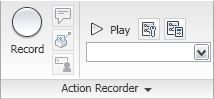 The Record command button starts the Action Recorder (ACTRECORD command). The Insert message command button allows you to insert a message in the Action tree, which will then be displayed during playback (ACTUSERMESSAGE command). The Insert Base Point command button is used to establish a point using absolute coordinates, for use by the prompts that follow in the macro (ACTBASEPOINT command). The Pause for User Input command button allows you to insert a request for user input in the macro (ACTUSERINPUT command). The Play command button plays back the macro selected in the Action Macro drop-down list. The Preference command button allows you to determine the behavior of the Action Recorder panel during recording and playback as well as indicate whether or not you want to be prompted for a macro name when recording is stopped. The Manage Action Macros command button allows you to copy, rename, modify or delete action macro files (ACTMANAGER). The Available Action Macro drop-down list allows you to choose from a list of available macros. The chosen macro is available for playback and is displayed in the Action Tree. The ACTMANAGER command can also be launched from the last item on the list.
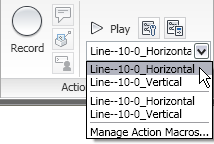 Click on the Action Recorder title bar to expand the panel and reveal the action tree. The contents of the macro chosen on the drop-down list will be displayed in the Action Tree.
CAD Standards Panel
The CAD Standards Panel contains commands related to the AutoCAD® CAD Standards feature.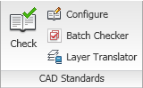 The Check command button runs the CHECKSTANDARDS command to check the current drawing for standards violations. The Configure command button allows you to associate the current drawing with one or more standards files (STANDARDS command). The Batch Checker command button allows you to specify one or more drawings to be checked (BATCHSTANDARDSCHECKER command). The Layer Translator command button runs the LAYTRANS command, allowing you to map the layers in the current drawing to layer names and properties in another drawing file or in a standards file, and then convert the layers in the current drawing based on that mapping.
Project Standards Panel
The Project Standards Panel contains commands related to the AutoCAD Architecture Project Standards feature. You must be working in an AutoCAD Architecture project (using Project Browser and Project Navigator) in order to make use of these tools.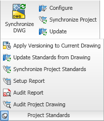 The Synchronize DWG command button will update the current drawing using the styles and settings defined in the project standards drawing(s) for the current project (SYNCHRONIZEPROJECTDRAWING command). The Configure command button allows you to indicate the project standards with which the current drawing will synchronize (PROJECTSTANDARDS command). The Synchronize Project command button runs the SYNCHRONIZEPROJECT command, which will synchronize all of the drawings in a project to the styles and settings in the project standards drawing(s). The Update command button will update the project standards check file (AutoCAD standards) for each file in the project. Select the Project Standards title bar to expand the panel and reveal additional command buttons related to Project Standards: Apply Versioning to Current Drawing (VERSIONMODIFIEDOBJECTS), Update Standards from Drawing (UPDATESTANDARDS), Synchronize Project Standards (SYNCHRONIZESTANDARDS), Setup Report (PROJECTSTANDARDSSETUPREPORT), Audit Report (AUDITPROJECT) and Audit Project Drawing (AUDITPROJECTDRAWING).
Style & Display Panel
The Style & Display Panel offers commands related to AutoCAD Architecture styles and display system.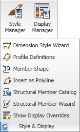 The Style Manager command button opens the Style Manager, allowing you to create, edit and/or delete styles and definitions (STYLEMANAGER). The Display Manager command button opens the Display Manager, so that you can create and/or edit drawing default settings for Display Representations, create and/or edit Display Representation Sets and create and/or edit Display Configurations (DISPLAYMANAGER). Click on the Style & Display title bar to expand the panel and reveal seven additional command buttons. The Dimension Style Wizard command button opens the AEC Dimension Display Wizard, allowing you to change the display properties of AEC Dimension Styles (DIMWIZARD). The Profile Definitions command button opens the Style Manager, filtered for Profile Definitions (PROFILEDEFINE). The Member Shape command button opens the Insert Member Shapes dialog, which allows you to insert one of the structural member shapes defined in the drawing (MEMBERSHAPEINSERT). The Insert as Polyline command button allows you to insert a profile defined in the current drawing as a polyline (PROFILEASPOLYLINE). The Structural Member Catalog command button opens the Structural Member Catalog dialog, which allows you to create Structural Member Styles (and the associated Structural Member Shapes) from a listing of predefined, industry-standard shapes (MEMBERCATALOG). The Structural Member Wizard command button opens the Structural Member Style Wizard dialog, which allows you to create Structural Member Styles based on user-input dimensions for a variety of basic shapes (MEMBERSTYLEWIZARD). The Show Display Overrides command button (SHOWDISPLAYOVERRIDES) allows you to easily identify objects that have an object-level display override by highlighting and/or listing them.
Applications Panel
The Applications Panel has commands related to custom applications that can be run in AutoCAD Architecture, such as AutoLISP or VBA routines.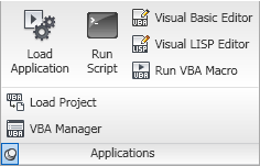 The Load Application command button runs the APPLOAD command, allowing you to load and unload custom applications and to add customizations to the Startup Suite, which will then be loaded each time you start AutoCAD Architecture. The Run Script command button allows you to execute script file (SCRIPT command). The Visual Basic Editor command button displays the Visual Basic Editor, allowing you to edit VBA projects (VBAIDE). The Visual LISP Editor command button runs the VLISP command, calling up the Visual LISP Integrated Development Environment window, where you can create and edit LISP routines. The Run VBA Macro allows you to run, edit or delete a VBA macro (VBARUN). Click on the Applications title bar to expand the panel and reveal two additional command buttons: Load Project, to load a global VBA project into the current work session (VBALOAD) and VBA Manager, to manage your VBA projects in a dialog box (VBAMAN). Note that in the 2010 release, Microsoft® Visual Basic® for Applications software is not installed when AutoCAD Architecture is installed. You can download the files needed to use VBA in AutoCAD at http://www.autodesk.com/vba-download.
Customization Panel
The Customization Panel has commands related to customizing the AutoCAD Architecture user interface.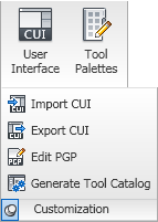 The User Interface command button opens the Customize User Interface dialog, which gives you full access to customizing most aspects of the user interface (CUI command). The Tool Palettes command button opens the Customize dialog, allowing you to customize the organization of tool palettes and tool palette groups, the one part of the interface not covered by the CUI dialog (Customize command). Click on the Customization title bar to expand the panel and reveal four additional command buttons. The Import CUI command button opens the Customize User Interface dialog, with the Transfer tab current, ready to transfer items from an enterprise or partial CUIX file to the main CUIX file (CUIIMPORT command). The Export CUI command button also opens the Customize User Interface dialog to the Transfer tab and allows you to export items from the main customization file to an enterprise or partial CUIX file (CUIEXPORT command). In fact, you can use either of those tools to move files between the main CUIX file and any other CUIX file you choose to open. The only difference is the Import CUI command button puts the main CUIX file on the right side, and the Export CUI command button puts the main CUIX file on the left side. The Edit PGP command button opens the first ACAD.pgp file found in the search path for editing (on my computer, in Notepad). The Generate Tool Catalog command button opens the Populate Tool Catalog from Content Drawings dialog, which allows you to create tools for selected ACA object types from a selected source file and place the tools in a new or existing tool catalog (AECTOOLCATALOGGENERATOR command). The tools can be created in Categories or in Palettes.
The Manage tab is the sixth static (always available) tab provided in the out-of-the-box ACA CUI. The image below and all screen captures in this article are based on the shipping version.

Navigate Panel
The Action Recorder Panel contains commands related to using the Action Recorder to save, edit and play back command sequences.
 The Record command button starts the Action Recorder (ACTRECORD command). The Insert message command button allows you to insert a message in the Action tree, which will then be displayed during playback (ACTUSERMESSAGE command). The Insert Base Point command button is used to establish a point using absolute coordinates, for use by the prompts that follow in the macro (ACTBASEPOINT command). The Pause for User Input command button allows you to insert a request for user input in the macro (ACTUSERINPUT command). The Play command button plays back the macro selected in the Action Macro drop-down list. The Preference command button allows you to determine the behavior of the Action Recorder panel during recording and playback as well as indicate whether or not you want to be prompted for a macro name when recording is stopped. The Manage Action Macros command button allows you to copy, rename, modify or delete action macro files (ACTMANAGER). The Available Action Macro drop-down list allows you to choose from a list of available macros. The chosen macro is available for playback and is displayed in the Action Tree. The ACTMANAGER command can also be launched from the last item on the list.
 Click on the Action Recorder title bar to expand the panel and reveal the action tree. The contents of the macro chosen on the drop-down list will be displayed in the Action Tree.
CAD Standards Panel
The CAD Standards Panel contains commands related to the AutoCAD® CAD Standards feature.
 The Check command button runs the CHECKSTANDARDS command to check the current drawing for standards violations. The Configure command button allows you to associate the current drawing with one or more standards files (STANDARDS command). The Batch Checker command button allows you to specify one or more drawings to be checked (BATCHSTANDARDSCHECKER command). The Layer Translator command button runs the LAYTRANS command, allowing you to map the layers in the current drawing to layer names and properties in another drawing file or in a standards file, and then convert the layers in the current drawing based on that mapping.
Project Standards Panel
The Project Standards Panel contains commands related to the AutoCAD Architecture Project Standards feature. You must be working in an AutoCAD Architecture project (using Project Browser and Project Navigator) in order to make use of these tools.
 The Synchronize DWG command button will update the current drawing using the styles and settings defined in the project standards drawing(s) for the current project (SYNCHRONIZEPROJECTDRAWING command). The Configure command button allows you to indicate the project standards with which the current drawing will synchronize (PROJECTSTANDARDS command). The Synchronize Project command button runs the SYNCHRONIZEPROJECT command, which will synchronize all of the drawings in a project to the styles and settings in the project standards drawing(s). The Update command button will update the project standards check file (AutoCAD standards) for each file in the project. Select the Project Standards title bar to expand the panel and reveal additional command buttons related to Project Standards: Apply Versioning to Current Drawing (VERSIONMODIFIEDOBJECTS), Update Standards from Drawing (UPDATESTANDARDS), Synchronize Project Standards (SYNCHRONIZESTANDARDS), Setup Report (PROJECTSTANDARDSSETUPREPORT), Audit Report (AUDITPROJECT) and Audit Project Drawing (AUDITPROJECTDRAWING).
Style & Display Panel
The Style & Display Panel offers commands related to AutoCAD Architecture styles and display system.
 The Style Manager command button opens the Style Manager, allowing you to create, edit and/or delete styles and definitions (STYLEMANAGER). The Display Manager command button opens the Display Manager, so that you can create and/or edit drawing default settings for Display Representations, create and/or edit Display Representation Sets and create and/or edit Display Configurations (DISPLAYMANAGER). Click on the Style & Display title bar to expand the panel and reveal seven additional command buttons. The Dimension Style Wizard command button opens the AEC Dimension Display Wizard, allowing you to change the display properties of AEC Dimension Styles (DIMWIZARD). The Profile Definitions command button opens the Style Manager, filtered for Profile Definitions (PROFILEDEFINE). The Member Shape command button opens the Insert Member Shapes dialog, which allows you to insert one of the structural member shapes defined in the drawing (MEMBERSHAPEINSERT). The Insert as Polyline command button allows you to insert a profile defined in the current drawing as a polyline (PROFILEASPOLYLINE). The Structural Member Catalog command button opens the Structural Member Catalog dialog, which allows you to create Structural Member Styles (and the associated Structural Member Shapes) from a listing of predefined, industry-standard shapes (MEMBERCATALOG). The Structural Member Wizard command button opens the Structural Member Style Wizard dialog, which allows you to create Structural Member Styles based on user-input dimensions for a variety of basic shapes (MEMBERSTYLEWIZARD). The Show Display Overrides command button (SHOWDISPLAYOVERRIDES) allows you to easily identify objects that have an object-level display override by highlighting and/or listing them.
Applications Panel
The Applications Panel has commands related to custom applications that can be run in AutoCAD Architecture, such as AutoLISP or VBA routines.
 The Load Application command button runs the APPLOAD command, allowing you to load and unload custom applications and to add customizations to the Startup Suite, which will then be loaded each time you start AutoCAD Architecture. The Run Script command button allows you to execute script file (SCRIPT command). The Visual Basic Editor command button displays the Visual Basic Editor, allowing you to edit VBA projects (VBAIDE). The Visual LISP Editor command button runs the VLISP command, calling up the Visual LISP Integrated Development Environment window, where you can create and edit LISP routines. The Run VBA Macro allows you to run, edit or delete a VBA macro (VBARUN). Click on the Applications title bar to expand the panel and reveal two additional command buttons: Load Project, to load a global VBA project into the current work session (VBALOAD) and VBA Manager, to manage your VBA projects in a dialog box (VBAMAN). Note that in the 2010 release, Microsoft® Visual Basic® for Applications software is not installed when AutoCAD Architecture is installed. You can download the files needed to use VBA in AutoCAD at http://www.autodesk.com/vba-download.
Customization Panel
The Customization Panel has commands related to customizing the AutoCAD Architecture user interface.
 The User Interface command button opens the Customize User Interface dialog, which gives you full access to customizing most aspects of the user interface (CUI command). The Tool Palettes command button opens the Customize dialog, allowing you to customize the organization of tool palettes and tool palette groups, the one part of the interface not covered by the CUI dialog (Customize command). Click on the Customization title bar to expand the panel and reveal four additional command buttons. The Import CUI command button opens the Customize User Interface dialog, with the Transfer tab current, ready to transfer items from an enterprise or partial CUIX file to the main CUIX file (CUIIMPORT command). The Export CUI command button also opens the Customize User Interface dialog to the Transfer tab and allows you to export items from the main customization file to an enterprise or partial CUIX file (CUIEXPORT command). In fact, you can use either of those tools to move files between the main CUIX file and any other CUIX file you choose to open. The only difference is the Import CUI command button puts the main CUIX file on the right side, and the Export CUI command button puts the main CUIX file on the left side. The Edit PGP command button opens the first ACAD.pgp file found in the search path for editing (on my computer, in Notepad). The Generate Tool Catalog command button opens the Populate Tool Catalog from Content Drawings dialog, which allows you to create tools for selected ACA object types from a selected source file and place the tools in a new or existing tool catalog (AECTOOLCATALOGGENERATOR command). The tools can be created in Categories or in Palettes.
February 16, 2010
AutoCAD® Architecture 2010 - UI Changes, Part 7 - The Ribbon, View Tab
View Tab
The View tab is the fifth static (always available) tab provided in the out-of-the-box ACA CUI. The image below and all screen captures in this article are based on the shipping version.
Navigate Panel
The Navigate Panel contains commands related to navigating within a drawing.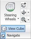 The Steering Wheels split button allows you to activate the Steering Wheel and choose the desired type.
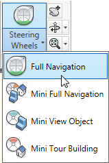 The drop-down list offers a choice between the Full Navigation Steering Wheel and three “mini” steering wheels; the main button initially defaults to Full Navigation, but will change to the most recently selected item from the list. The Pan Realtime command button executes the PAN command. The Orbit split button allows you to initiate one of three orbit types.
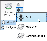 The drop-down includes the Orbit (3DORBIT), Free Orbit (3DFORBIT) and Continuous Orbit (3DCORBIT) commands. The last one chosen becomes the one activated by the main command button. The Zoom split button allows you to perform various ZOOM command options.
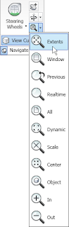 These are the same options available from the Zoom split button on the View panel (floating/Home tab), with the exception of omitting the Pan Realtime button, which is available separately on the Navigate panel. Click on the Navigate panel title bar to expand the panel and reveal the View Cube command button. This will only be active when your visual style is set to something other than 2D Wireframe; when active, it toggles the display of the View Cube on and off in all locations (main drawing window as well as other windows, such as the Object Viewer).
Appearance Panel
The Appearance Panel contains commands related to the drawing view and the appearance of objects.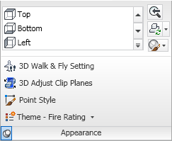 The View drop-down button displays a list of defined Views in the current drawing and allows you to restore one by selecting it.
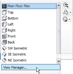 Use the up and down arrows at the right to scroll the list or use the drop-down button at the bottom right to see the defined Views in a drop-down list and expose the View Manager button, which opens the View Manager dialog (VIEW command). The Previous View command button runs the Previous option of the VIEW command. The Regenerate split button offers a choice of three regeneration-related commands: Regenerate Drawing (REGEN command), Regenerate Drawing and Viewports (REGENALL command) and AutoCAD-Architecture-specific Regenerate Model (OBJRELUPDATE command).
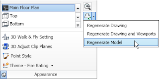 The main button always runs the Regenerate Drawing (REGEN) command. The Visual Styles drop-down button allows you to choose one of the currently defined visual styles in the drawing from an icon list (choice runs VSCURRENT command), save the current visual display as a named style (VSSAVE command) – provided that 2D Wireframe is not the current setting or open the Visual Styles Manager palette (VISUALSTYLES command).
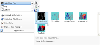 Expanding the panel by selecting the Appearance title bar provides access to four additional buttons. The 3D Walk & Fly Settings button opens the Walk and Fly Settings dialog (WALKFLYSETTINGS). The 3D Adjust Clip Planes button (3DCLIP) opens the Adjust Clippling Planes dialog. The Point Style button opens the Point Style dialog (DDPTYPE), allowing you to specify how Point objects appear on the screen. The Theme – Fire Rating drop-down button allows you to activate one of seven out-of-the-box Display Themes (DISPLAYTHEMEADD command).
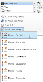 Each of the buttons on the drop-down runs a ribbon tool.
Coordinates Panel
The Coordinates Panel contains commands related to the User Coordinate System (UCS) and the UCS Icon.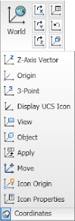 The World command button sets the UCS to “World,” aligning it with the World Coordinate System (WCS) (UCS command, World option). The X, Y and Z command buttons (left buttons on top, middle and bottom rows of the main panel) allow you to rotate the current UCS about the X-, Y- and Z-axes, respectively (UCS command; X, Y and Z options). The Named command button (top row, right button) opens the UCS dialog to the Named UCSs tab, allowing you to manage the defined user coordinate systems in the current drawing (UCSMAN). The Previous command button (middle row, right button) restores the previously current UCS for the current space (model or paper) – the last 10 in each space are retained (UCS command, Previous option). The Face command button aligns the UCS to a selected face on a 3D Solid (ALIGNUCSTOFACE). Selecting the Coordinates title bar expands the panel to reveal ten additional command buttons. The Z-Axis Vector command button moves the UCS origin to the first point selected and then rotates the UCS to have the Z-axis pass through the second point selected (UCS command, ZAxis option). The Origin command button moves the UCS origin point to a specified point (UCS command, Origin option). The 3-Point command button allows the user to establish a UCS by specifying an origin point, a point on the positive X-axis and a point on the positive Y-axis. (UCS command, 3point option). The Display UCS Icon command button toggles the visibility of the UCS icon in the current viewport (UCSICON command, ON and OFF options). The Apply command button applies the current UCS to a selected viewport (UCS command, Apply option). The Move command button moves a defined UCS (UCS command, Move option). The difference between the Origin and Move options is that Origin creates a new UCS with the specified origin point while Move redefines the current UCS, possibly affecting other viewports (unless the WCS is current, in which case Move also creates a new, unnamed UCS). The Icon Origin command button toggles between the two possible locations for the display of the UCS Icon – at the UCS Origin, if the current view permits, or always in the lower-left corner, even if the current view would permit (UCSICON command, Noorigin and Origin options). The Icon Properties command button opens the UCS Icon dialog, which allows you to control the appearance of the UCS Icon, including style, size and color.
Viewports Panel
The Viewports Panel contains commands related to both tiled (Model tab) and floating (Layout tab) viewports.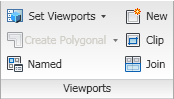 The Set Viewports drop-down button, only active when the Model tab is active, allows you to choose from a list of pre-defined tiled viewport configurations (VPORTS command).
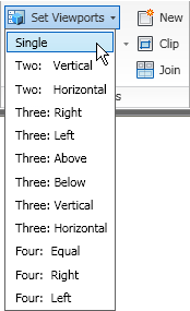 The Create Viewport split button, only active when a Layout tab is active, has two command buttons on the drop-down list: Create Polygonal, allowing you to draw a polygonal viewport by selecting vertex points (-VPORTS command, Polygonal option) and Create from Object, which allows you to select a closed polyline or a circle and create a viewport in that shape (-VPORTS command, Object option).
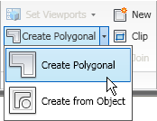 The last button selected on the drop-down list becomes the command executed by the main button. The Named command button opens the Viewports dialog to the Named tab, where saved viewport configurations can be selected (VPORTS). The New command button opens the Viewports dialog to the New Viewports tab and allows you to create a new named viewport configuration, or edit existing ones (VPORTS). The Clip command button, which can only be used in a Layout tab (TileMode 0), runs the VPCLIP command, which allows you to clip an existing floating viewport, either using an existing closed object (polyline or circle) as the clipping boundary or allowing you to draw a polygonal boundary on the fly. The Join command button, only active when the Model tab is current, allows you to join two adjacent tiled viewports, provided that the end result is a rectangle (-VPORTS command, Join option).
Face Effects Panel
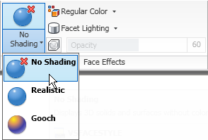
The Face Effects Panel contains commands related to the way faces of 3D objects display.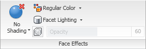 The VSFaceStyle split button allows you to choose type of shading used on the faces, no shading, realistic or gooch.
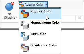
 The Color split button allows you to set a new value for VSColorMode: 0 (regular), 1 (monochrome), 2 (tint) or 3 (desaturate).
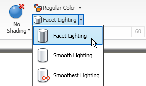
 The Lighting split button allows you to set a value for VSLightingQuality: 0 (facet), 1 (smooth) or 2 (smoothest).
 The main command button will change to the last option selected from the drop-down for all three of these split buttons. The X-Ray Effect command button toggles the sign of the value of VSFaceOpacity, turning the x-ray effect on and off. When it is on, the Opacity slider control allows you to change the level of transparency, from 0 to 100. On my computer, both 0 shows with full opacity, 1 is the most transparent and 100 is full opacity. For this to be effective, the current visual style needs to be a type that hides and face shading must be turned on.
Edge Effects Panel
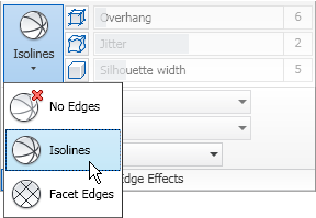
The Edge Effects Panel contains commands related to the way edges of 3D objects display.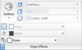 The VSEdges drop-down button allows you to select an edge display type: No Edges, Isolines or Facet Edges (VSEDGES). Supported edge types varies between the available visual style types.
 The Edge Overhang command button toggles on and off the effect that extends the edge lines of 3D solids and Mass Elements beyond the end of the edge (VSEDGEOVERHANG). The adjacent slider control allows you to control the amount of the overhang (VSEDGEOVERHANG). The Edge Jitter command button toggles on and off the effect that makes the edges of 3D Solids and Mass Elements “wavy” (VSEDGEJITTER). The adjacent slider control allows you to control the degree of waviness. The Silhouette Edges command button toggles on and off the display of a silhouette around the outer edges of 3D Solids and Mass Elements (VSSILHEDGES). The adjacent slider control allows you to control the width of the silhouette. Selecting the Edge Effects title bar expands the panel to reveal two toggles and three drop-down lists command buttons. When VSEdges is set to Facet Edges, the Obscurred Edges (VSOBSCUREDEDGES) and Intersection Edges (VSINTERSECTIONEDGES) become active, allowing you to toggle the display of obscurred (hidden) edges and the edges at the intersection of two 3D Solids or Mass Elements. When toggled on, the adjacent drop-down list becomes active, allowing you to set the color of obscured edges (VSOBSCUREDCOLOR) or intersection edges (VSINTERSECTIONCOLOR). The bottom drop-down allows you to set the color of visible edges of 3D Solids or Mass Elements (VSEDGECOLOR).
Windows Panel
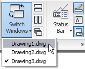
The Windows Panel contains commands related to drawing and other interface windows.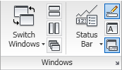 The Switch Windows drop-down button allows you to make any of the currently open drawings active, by selecting it from a list.
 The Tile Horizontally, Tile Vertically and Cascade command buttons allow you to control the display of the currently open drawing windows (SYSWINDOWS). The Status Bar Options drop-down list allows you to control the display of icons and notifications on the Application Status Bar.
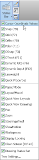 The Drawing Status Bar command button toggles the display of the Drawing Window Status Bar (STATUSBAR). The Text Window command button toggles the display of the AutoCAD Text Window (TXTSCR). The Command Line command button toggles the display of the Command Line Window (COMMANDLINE). Clicking on the arrow icon at the far right of the Windows title bar executes the OPTIONS command, opening the Options dialog to the Display tab.
The View tab is the fifth static (always available) tab provided in the out-of-the-box ACA CUI. The image below and all screen captures in this article are based on the shipping version.

Navigate Panel
The Navigate Panel contains commands related to navigating within a drawing.
 The Steering Wheels split button allows you to activate the Steering Wheel and choose the desired type.
 The drop-down list offers a choice between the Full Navigation Steering Wheel and three “mini” steering wheels; the main button initially defaults to Full Navigation, but will change to the most recently selected item from the list. The Pan Realtime command button executes the PAN command. The Orbit split button allows you to initiate one of three orbit types.
 The drop-down includes the Orbit (3DORBIT), Free Orbit (3DFORBIT) and Continuous Orbit (3DCORBIT) commands. The last one chosen becomes the one activated by the main command button. The Zoom split button allows you to perform various ZOOM command options.
 These are the same options available from the Zoom split button on the View panel (floating/Home tab), with the exception of omitting the Pan Realtime button, which is available separately on the Navigate panel. Click on the Navigate panel title bar to expand the panel and reveal the View Cube command button. This will only be active when your visual style is set to something other than 2D Wireframe; when active, it toggles the display of the View Cube on and off in all locations (main drawing window as well as other windows, such as the Object Viewer).
Appearance Panel
The Appearance Panel contains commands related to the drawing view and the appearance of objects.
 The View drop-down button displays a list of defined Views in the current drawing and allows you to restore one by selecting it.
 Use the up and down arrows at the right to scroll the list or use the drop-down button at the bottom right to see the defined Views in a drop-down list and expose the View Manager button, which opens the View Manager dialog (VIEW command). The Previous View command button runs the Previous option of the VIEW command. The Regenerate split button offers a choice of three regeneration-related commands: Regenerate Drawing (REGEN command), Regenerate Drawing and Viewports (REGENALL command) and AutoCAD-Architecture-specific Regenerate Model (OBJRELUPDATE command).
 The main button always runs the Regenerate Drawing (REGEN) command. The Visual Styles drop-down button allows you to choose one of the currently defined visual styles in the drawing from an icon list (choice runs VSCURRENT command), save the current visual display as a named style (VSSAVE command) – provided that 2D Wireframe is not the current setting or open the Visual Styles Manager palette (VISUALSTYLES command).
 Expanding the panel by selecting the Appearance title bar provides access to four additional buttons. The 3D Walk & Fly Settings button opens the Walk and Fly Settings dialog (WALKFLYSETTINGS). The 3D Adjust Clip Planes button (3DCLIP) opens the Adjust Clippling Planes dialog. The Point Style button opens the Point Style dialog (DDPTYPE), allowing you to specify how Point objects appear on the screen. The Theme – Fire Rating drop-down button allows you to activate one of seven out-of-the-box Display Themes (DISPLAYTHEMEADD command).
 Each of the buttons on the drop-down runs a ribbon tool.
Coordinates Panel
The Coordinates Panel contains commands related to the User Coordinate System (UCS) and the UCS Icon.
 The World command button sets the UCS to “World,” aligning it with the World Coordinate System (WCS) (UCS command, World option). The X, Y and Z command buttons (left buttons on top, middle and bottom rows of the main panel) allow you to rotate the current UCS about the X-, Y- and Z-axes, respectively (UCS command; X, Y and Z options). The Named command button (top row, right button) opens the UCS dialog to the Named UCSs tab, allowing you to manage the defined user coordinate systems in the current drawing (UCSMAN). The Previous command button (middle row, right button) restores the previously current UCS for the current space (model or paper) – the last 10 in each space are retained (UCS command, Previous option). The Face command button aligns the UCS to a selected face on a 3D Solid (ALIGNUCSTOFACE). Selecting the Coordinates title bar expands the panel to reveal ten additional command buttons. The Z-Axis Vector command button moves the UCS origin to the first point selected and then rotates the UCS to have the Z-axis pass through the second point selected (UCS command, ZAxis option). The Origin command button moves the UCS origin point to a specified point (UCS command, Origin option). The 3-Point command button allows the user to establish a UCS by specifying an origin point, a point on the positive X-axis and a point on the positive Y-axis. (UCS command, 3point option). The Display UCS Icon command button toggles the visibility of the UCS icon in the current viewport (UCSICON command, ON and OFF options). The Apply command button applies the current UCS to a selected viewport (UCS command, Apply option). The Move command button moves a defined UCS (UCS command, Move option). The difference between the Origin and Move options is that Origin creates a new UCS with the specified origin point while Move redefines the current UCS, possibly affecting other viewports (unless the WCS is current, in which case Move also creates a new, unnamed UCS). The Icon Origin command button toggles between the two possible locations for the display of the UCS Icon – at the UCS Origin, if the current view permits, or always in the lower-left corner, even if the current view would permit (UCSICON command, Noorigin and Origin options). The Icon Properties command button opens the UCS Icon dialog, which allows you to control the appearance of the UCS Icon, including style, size and color.
Viewports Panel
The Viewports Panel contains commands related to both tiled (Model tab) and floating (Layout tab) viewports.
 The Set Viewports drop-down button, only active when the Model tab is active, allows you to choose from a list of pre-defined tiled viewport configurations (VPORTS command).
 The Create Viewport split button, only active when a Layout tab is active, has two command buttons on the drop-down list: Create Polygonal, allowing you to draw a polygonal viewport by selecting vertex points (-VPORTS command, Polygonal option) and Create from Object, which allows you to select a closed polyline or a circle and create a viewport in that shape (-VPORTS command, Object option).
 The last button selected on the drop-down list becomes the command executed by the main button. The Named command button opens the Viewports dialog to the Named tab, where saved viewport configurations can be selected (VPORTS). The New command button opens the Viewports dialog to the New Viewports tab and allows you to create a new named viewport configuration, or edit existing ones (VPORTS). The Clip command button, which can only be used in a Layout tab (TileMode 0), runs the VPCLIP command, which allows you to clip an existing floating viewport, either using an existing closed object (polyline or circle) as the clipping boundary or allowing you to draw a polygonal boundary on the fly. The Join command button, only active when the Model tab is current, allows you to join two adjacent tiled viewports, provided that the end result is a rectangle (-VPORTS command, Join option).
Face Effects Panel
The Face Effects Panel contains commands related to the way faces of 3D objects display.
 The VSFaceStyle split button allows you to choose type of shading used on the faces, no shading, realistic or gooch.
 The Color split button allows you to set a new value for VSColorMode: 0 (regular), 1 (monochrome), 2 (tint) or 3 (desaturate).
 The Lighting split button allows you to set a value for VSLightingQuality: 0 (facet), 1 (smooth) or 2 (smoothest).
 The main command button will change to the last option selected from the drop-down for all three of these split buttons. The X-Ray Effect command button toggles the sign of the value of VSFaceOpacity, turning the x-ray effect on and off. When it is on, the Opacity slider control allows you to change the level of transparency, from 0 to 100. On my computer, both 0 shows with full opacity, 1 is the most transparent and 100 is full opacity. For this to be effective, the current visual style needs to be a type that hides and face shading must be turned on.
Edge Effects Panel
The Edge Effects Panel contains commands related to the way edges of 3D objects display.
 The VSEdges drop-down button allows you to select an edge display type: No Edges, Isolines or Facet Edges (VSEDGES). Supported edge types varies between the available visual style types.
 The Edge Overhang command button toggles on and off the effect that extends the edge lines of 3D solids and Mass Elements beyond the end of the edge (VSEDGEOVERHANG). The adjacent slider control allows you to control the amount of the overhang (VSEDGEOVERHANG). The Edge Jitter command button toggles on and off the effect that makes the edges of 3D Solids and Mass Elements “wavy” (VSEDGEJITTER). The adjacent slider control allows you to control the degree of waviness. The Silhouette Edges command button toggles on and off the display of a silhouette around the outer edges of 3D Solids and Mass Elements (VSSILHEDGES). The adjacent slider control allows you to control the width of the silhouette. Selecting the Edge Effects title bar expands the panel to reveal two toggles and three drop-down lists command buttons. When VSEdges is set to Facet Edges, the Obscurred Edges (VSOBSCUREDEDGES) and Intersection Edges (VSINTERSECTIONEDGES) become active, allowing you to toggle the display of obscurred (hidden) edges and the edges at the intersection of two 3D Solids or Mass Elements. When toggled on, the adjacent drop-down list becomes active, allowing you to set the color of obscured edges (VSOBSCUREDCOLOR) or intersection edges (VSINTERSECTIONCOLOR). The bottom drop-down allows you to set the color of visible edges of 3D Solids or Mass Elements (VSEDGECOLOR).
Windows Panel
The Windows Panel contains commands related to drawing and other interface windows.
 The Switch Windows drop-down button allows you to make any of the currently open drawings active, by selecting it from a list.
 The Tile Horizontally, Tile Vertically and Cascade command buttons allow you to control the display of the currently open drawing windows (SYSWINDOWS). The Status Bar Options drop-down list allows you to control the display of icons and notifications on the Application Status Bar.
 The Drawing Status Bar command button toggles the display of the Drawing Window Status Bar (STATUSBAR). The Text Window command button toggles the display of the AutoCAD Text Window (TXTSCR). The Command Line command button toggles the display of the Command Line Window (COMMANDLINE). Clicking on the arrow icon at the far right of the Windows title bar executes the OPTIONS command, opening the Options dialog to the Display tab.
January 09, 2010
Unexpected Automatic Offsets?
If you have ever used the out-of-the-box Door or Window tools with the Offset/Center option current, and wondered why the offset amount always defaults to 6" (Imperial tools), read on. My office's standard offset for Doors is 6" and that is usually the default value for me, so I would not have noticed. But thanks to this post in the Autodesk AutoCAD® Architecture Discussion Group, I discovered that the Door and Window tools on the Imperial Doors and Windows palettes in the Design Tool Palette Group have a "hidden" offset setting of 6". So even if your default offset is set to something else, when using the tool the value will be set to 6".
At first glance, it does not appear that there is any such setting. As shown below, the properties of the Hinged - Single Door Tool do not appear to include a preset offset value.
The Position along wall property is set to "--", which means that the current default value for that property (check the Properties palette after executing the tool to see what that is) will be used. If it is Offset/Center, then the value of the Automatic offset property will control what the offset value will be. But that property does not show up unless Position along wall is set to Offset/Center, in either the Properties palette or the Tool properties. So set the Position along wall property to Offset/Center in the Tool's properties, and the "hidden" Automatic offset property value will appear.
If you do not want this set to 6", set it to a different value, or use the dropdown list to choose "--" to allow the current default value to be the initial value after executing the tool. If you do not want Offset/Center to be the initial value for Position along wall, then reset that to "--" and click OK.
You will need to do that for all of the tools on the Doors and Windows palettes, if you do not want to have the 6" Automatic offset value. The good news is that the tools in the Design Tool Catalog - Imperial do not appear to have a hidden preset value assigned to them. I checked all of the Door tools, and a few of the Window and Door/Window Assembly tools, and the Automatic offset property was set to "--" in each. The generic tools on the Design tab also do not have a preset value.
Users of the US Metric out-of-the-box profile should not feel left out; there is a 125 mm preset offset on the Window tools and all of the Door tools except for the Overhead Sectional tool. I spot checked a few of the Design Tool Catalog - Metric and all of those did not have a preset Automatic offset. I spot checked a few of the out-of-the-box Door tools for the AutoCAD Architecture (UK) profile and none of those had a preset value.
At first glance, it does not appear that there is any such setting. As shown below, the properties of the Hinged - Single Door Tool do not appear to include a preset offset value.

The Position along wall property is set to "--", which means that the current default value for that property (check the Properties palette after executing the tool to see what that is) will be used. If it is Offset/Center, then the value of the Automatic offset property will control what the offset value will be. But that property does not show up unless Position along wall is set to Offset/Center, in either the Properties palette or the Tool properties. So set the Position along wall property to Offset/Center in the Tool's properties, and the "hidden" Automatic offset property value will appear.

If you do not want this set to 6", set it to a different value, or use the dropdown list to choose "--" to allow the current default value to be the initial value after executing the tool. If you do not want Offset/Center to be the initial value for Position along wall, then reset that to "--" and click OK.
You will need to do that for all of the tools on the Doors and Windows palettes, if you do not want to have the 6" Automatic offset value. The good news is that the tools in the Design Tool Catalog - Imperial do not appear to have a hidden preset value assigned to them. I checked all of the Door tools, and a few of the Window and Door/Window Assembly tools, and the Automatic offset property was set to "--" in each. The generic tools on the Design tab also do not have a preset value.
Users of the US Metric out-of-the-box profile should not feel left out; there is a 125 mm preset offset on the Window tools and all of the Door tools except for the Overhead Sectional tool. I spot checked a few of the Design Tool Catalog - Metric and all of those did not have a preset Automatic offset. I spot checked a few of the out-of-the-box Door tools for the AutoCAD Architecture (UK) profile and none of those had a preset value.
December 29, 2009
Space Schedule with Header Rows, sorted by Level and Building/Wing
A request was posted to this thread in the Autodesk AutoCAD® Architecture Discussion Group, looking for a way to add three blank lines between different building wings in a Schedule Table. A sample image was attached to the post, showing a header label in the middle line.
I suggested that it would be possible to get close to what was shown, by adding some hidden columns to control the sorting and some "non-real" Spaces for the blank rows, similar to the techniques used in two previous posts from some time back (Clustering Spaces Within A Unit in a Space Schedule and Electrical Device Schedule Using Clustering). I noted that it would not be possible to have the vertical lines between columns stop at the row with the header text, and that the header text would not be able to be in a larger font or be able to extend across multiple columns. I was able to use the 2009 release to put together a sample file, posted in a reply in the Discussion Group thread, that demonstrates the required techniques to achieve the desired results. I did choose to omit the remarks column and also chose to make the ceiling height column a separate column, to avoid the need to build an Imperial feet-and-inches formatted string at the end of the ceiling finish.
To achieve the results shown, I took advantage of a feature not available in the 2005 release in which the earlier examples were done – Classification Definitions. I set up a Classification Definition called SpaceHeader that has two classifications: "Header", used to designate the Space Style used for the header rows, which are not "real" Spaces in the project, and "Space", used to designate Space Styles used for actual Spaces in the project. Using a Classification Definition offers two advantages: it allows identifying the header Spaces at the style-level and would make it easy to exclude these "non-real" Spaces from other Space-related Schedule Tables, such as one listing and totaling areas.
A custom Space Style, called Header, has display overrides to place all components on a non-plotting layer, a default size of 1" x 1" x 1" and is classified as "Header". The other Space Styles used in the sample files are out-of-the-box styles, set to the "Space" classification. The sample files include three "construct" files, representing the first, second and third floors, with sample spaces in two wings/buildings in each file, including three Header Spaces for each wing. There is also a "view" file into which the three construct files are externally referenced, with the Schedule Table. While the files are not part of an AutoCAD Architecture "project," the same techniques could be used when using Project Navigator.
The SpaceObjects2 Property Set Definition was created from scratch, to avoid any confusion that might arise from having "extra" properties from the out-of-the-box property sets. Once you understand how the properties in the sample file work, you will most likely want to incorporate the techniques into the object-based property set you are currently using for Spaces, to avoid having to recreate Schedule Tags and other Space-related Schedule Tables. The SpaceObjects 2 Property Set Definition includes manual properties for Sector, Level, Number and Number Suffix, which are combined in the RoomNumber-Composite formula property to create the room number for each real Space. If you are using Project Navigator, you can substitute a project property for the Level property, and, if you are using Divisions for your wings or separate buildings, you can also use a project property for the Sector property. I made the Number property an Integer-type manual property; if you prefer, this could be an Auto Increment – Integer type. The RoomName property is an automatic property, using the Room Name property of the Space. Substitute your firm’s standard way of doing room names if it differs.
Text-type manual properties to hold the floor, wall base, wall and ceiling finishes for each real Space are also included in the SpaceObjects2 Property Set Definition. An Integer-type manual property called SortOrder1, with a default value of 10, is used to control the sorting of the Header Spaces. Real Spaces all keep the default value (no editing required), assuring that they will be sorted after the Header Spaces for each respective floor/wing. One Header Space for each wing of each floor has SortOrder1 set to 1, another (the one with the header text in the room number column) is set to 2 and the third is set to 3. A Text-type manual property called HeaderText, with a default value of an empty string, is provided to allow entry of the header text. Only the Header Space that is assigned the SortOrder1 value of 2 has the default value for the HeaderText property edited.
An automatic property called Height, referencing the Height automatic property source for Spaces, is used to obtain the ceiling height automatically. A classification property called SpaceType is used to determine what SpaceHeader classification has been assigned to each Space.
The header rows are blank (or nearly blank) because the Schedule Table does not display any of the above noted properties directly. Instead, each visible column in the Schedule Table references a formula property, each of which is structured something like the one for RoomNumber-Schedule shown in the image below. In each formula, the value of the SpaceType property is checked to determine if the Space is a "Header" Space. If so, the RoomNumber-Schedule property returns the value of the HeaderText property (blank for header rows 1 and 3; the header text for header row 2). All of the other formulas return an empty string for Header Spaces. If the Space is a "real" Space, then the value of the corresponding property is passed through (RoomNumber-Composite for the RoomNumber-Schedule property).
Sorting is accomplished by including three hidden columns in the Schedule Table, for the Level, Sector and SortOrder1 properties. These three columns, along with the RoomNumber-Schedule column, are used to achieve the desired sorting.
 All of the Spaces are initially sorted by Level. Within each Level, the Spaces are sorted by Sector, then the SortOrder1 value is used to get the Header Spaces, in order, at the top of each Floor/Sector group. Finally, the RoomNumber-Schedule column is used to sort the real Spaces by room number.
While the final Schedule Table does not match the sample 100%, it is pretty close, and given that all of the graphics are part of the Schedule Table, and not additional, manually placed items that would have to be checked and updated every time the Schedule Table was updated, I think this is a very workable solution. One final note: this technique will not work for Schedule Tables that include a "total" for any column in the Schedule Table, since the blank rows will have a non-numeric empty string value.

I suggested that it would be possible to get close to what was shown, by adding some hidden columns to control the sorting and some "non-real" Spaces for the blank rows, similar to the techniques used in two previous posts from some time back (Clustering Spaces Within A Unit in a Space Schedule and Electrical Device Schedule Using Clustering). I noted that it would not be possible to have the vertical lines between columns stop at the row with the header text, and that the header text would not be able to be in a larger font or be able to extend across multiple columns. I was able to use the 2009 release to put together a sample file, posted in a reply in the Discussion Group thread, that demonstrates the required techniques to achieve the desired results. I did choose to omit the remarks column and also chose to make the ceiling height column a separate column, to avoid the need to build an Imperial feet-and-inches formatted string at the end of the ceiling finish.

To achieve the results shown, I took advantage of a feature not available in the 2005 release in which the earlier examples were done – Classification Definitions. I set up a Classification Definition called SpaceHeader that has two classifications: "Header", used to designate the Space Style used for the header rows, which are not "real" Spaces in the project, and "Space", used to designate Space Styles used for actual Spaces in the project. Using a Classification Definition offers two advantages: it allows identifying the header Spaces at the style-level and would make it easy to exclude these "non-real" Spaces from other Space-related Schedule Tables, such as one listing and totaling areas.
A custom Space Style, called Header, has display overrides to place all components on a non-plotting layer, a default size of 1" x 1" x 1" and is classified as "Header". The other Space Styles used in the sample files are out-of-the-box styles, set to the "Space" classification. The sample files include three "construct" files, representing the first, second and third floors, with sample spaces in two wings/buildings in each file, including three Header Spaces for each wing. There is also a "view" file into which the three construct files are externally referenced, with the Schedule Table. While the files are not part of an AutoCAD Architecture "project," the same techniques could be used when using Project Navigator.
The SpaceObjects2 Property Set Definition was created from scratch, to avoid any confusion that might arise from having "extra" properties from the out-of-the-box property sets. Once you understand how the properties in the sample file work, you will most likely want to incorporate the techniques into the object-based property set you are currently using for Spaces, to avoid having to recreate Schedule Tags and other Space-related Schedule Tables.
 The SpaceObjects 2 Property Set Definition includes manual properties for Sector, Level, Number and Number Suffix, which are combined in the RoomNumber-Composite formula property to create the room number for each real Space. If you are using Project Navigator, you can substitute a project property for the Level property, and, if you are using Divisions for your wings or separate buildings, you can also use a project property for the Sector property. I made the Number property an Integer-type manual property; if you prefer, this could be an Auto Increment – Integer type. The RoomName property is an automatic property, using the Room Name property of the Space. Substitute your firm’s standard way of doing room names if it differs.
Text-type manual properties to hold the floor, wall base, wall and ceiling finishes for each real Space are also included in the SpaceObjects2 Property Set Definition. An Integer-type manual property called SortOrder1, with a default value of 10, is used to control the sorting of the Header Spaces. Real Spaces all keep the default value (no editing required), assuring that they will be sorted after the Header Spaces for each respective floor/wing. One Header Space for each wing of each floor has SortOrder1 set to 1, another (the one with the header text in the room number column) is set to 2 and the third is set to 3. A Text-type manual property called HeaderText, with a default value of an empty string, is provided to allow entry of the header text. Only the Header Space that is assigned the SortOrder1 value of 2 has the default value for the HeaderText property edited.
An automatic property called Height, referencing the Height automatic property source for Spaces, is used to obtain the ceiling height automatically. A classification property called SpaceType is used to determine what SpaceHeader classification has been assigned to each Space.
The header rows are blank (or nearly blank) because the Schedule Table does not display any of the above noted properties directly. Instead, each visible column in the Schedule Table references a formula property, each of which is structured something like the one for RoomNumber-Schedule shown in the image below.
 In each formula, the value of the SpaceType property is checked to determine if the Space is a "Header" Space. If so, the RoomNumber-Schedule property returns the value of the HeaderText property (blank for header rows 1 and 3; the header text for header row 2). All of the other formulas return an empty string for Header Spaces. If the Space is a "real" Space, then the value of the corresponding property is passed through (RoomNumber-Composite for the RoomNumber-Schedule property).
Sorting is accomplished by including three hidden columns in the Schedule Table, for the Level, Sector and SortOrder1 properties.
 These three columns, along with the RoomNumber-Schedule column, are used to achieve the desired sorting.
 All of the Spaces are initially sorted by Level. Within each Level, the Spaces are sorted by Sector, then the SortOrder1 value is used to get the Header Spaces, in order, at the top of each Floor/Sector group. Finally, the RoomNumber-Schedule column is used to sort the real Spaces by room number.
While the final Schedule Table does not match the sample 100%, it is pretty close, and given that all of the graphics are part of the Schedule Table, and not additional, manually placed items that would have to be checked and updated every time the Schedule Table was updated, I think this is a very workable solution. One final note: this technique will not work for Schedule Tables that include a "total" for any column in the Schedule Table, since the blank rows will have a non-numeric empty string value.
December 18, 2009
AEC Content on the Ribbon - AU Tech Talk
 October 19, 2013 Update: The links to the Autodesk website no longer work for me, so I assume that the AU Tech Talk content has been taken down. I have posted the contents of my article on putting AEC Content on the ribbon in this post.
The December 2009 Edition of the AU Quarterly Newsletter is out. If you do not already receive the newsletter, you can do so by becoming a member of the AU Online site and requesting the newsletter in your profile, under the Preferences category. This edition includes a link to an AU Tech Talk article I wrote about accessing AEC Content from the ribbon. I had a chance to look into this topic more deeply since I last blogged about this topic.
The article is a fairly detailed tutorial (with pictures!) on how to customize a CUIX file to add a ribbon tool that "runs" a tool palette tool, enabling you to add your own custom AEC Content to a ribbon tab. You can access the AU Tech Talk page and look for my smiling face,
 or go right to the article (sorry, there is a picture of me there, too).
December 04, 2009
Revit Key Plans
Thanks to a little help from the AUGI Revit® Architecture Forum, I was able to add a key plan to the title block family in my current Revit project and, with the setting of one instance-based parameter for the title block on each sheet, display the appropriate key plan, or none at all. There are a number of suggestions and examples in that thread; here is what I did today.
I happened to have an AutoCAD® file that had the structural grid accurately drawn, so I made use of a copy of that, in AutoCAD® Architecture, to quickly draw the building outline and the match lines, determine the amount I needed to scale the outline down to fit in my key plan area and finally paste the scaled-down graphics into a new file created from scratch.
I started a new Generic Annotation family in Revit Architecture 2010, and imported my scaled-down drawing file, matching origin to origin. I traced over the graphics with Revit linework, added text and filled regions for each of the three sectors into which the plans are broken and popped in a north arrow. I then deleted the imported AutoCAD file from the family.
To be able to control the visibility of the graphics, I created four Yes/No parameters in the Family Types dialog: Outline, SectorA, SectorB and SectorC. I then created six family types: No Key Plan (all parameters unchecked), Outline Only (Outline parameter checked, others unchecked), Sector A (only Outline and SectorA checked), Sector B (only Outline and SectorB checked), Sector C (only Outline and SectorC checked) and Sectors A-B-C (all parameters checked).
 In the Instance Properties dialog for all of the graphics in the family, I set the Visible parameter to be equal to one of the Yes/No parameters. All of the graphics except for the filled regions were set to the Outline parameter and the filled regions were set to the appropriate "Sector" parameter.
After saving the family file, I loaded it into my title block family and placed an instance in the Key Plan area. I gave that instance a Label tied to an instance-based parameter called Key Plan that I placed under the Graphics category. I set the default value to No Key Plan, saved the title block family and reloaded it into my project.
Now, by simply setting the Key Plan parameter in the Instance Properties of each sheet's title block file, I can make the appropriate key plan display, and that key plan will be in the same location on each sheet. The Sector A key plan is shown above; the other options (other than No Key Plan, which is blank) are shown below and are a parameter setting away.
 Pretty slick, if I do say so myself. ;-) [As always, reduced images can be viewed full-size by clicking on them; use the Back button on your Browser to return to the article.]
October 19, 2011 Update: A more detailed explanation of how to embed key plan graphics in a title block family, with instance-based control over what, if any, graphics display at each title block, can be found in this blog article.
I happened to have an AutoCAD® file that had the structural grid accurately drawn, so I made use of a copy of that, in AutoCAD® Architecture, to quickly draw the building outline and the match lines, determine the amount I needed to scale the outline down to fit in my key plan area and finally paste the scaled-down graphics into a new file created from scratch.
I started a new Generic Annotation family in Revit Architecture 2010, and imported my scaled-down drawing file, matching origin to origin. I traced over the graphics with Revit linework, added text and filled regions for each of the three sectors into which the plans are broken and popped in a north arrow. I then deleted the imported AutoCAD file from the family.
To be able to control the visibility of the graphics, I created four Yes/No parameters in the Family Types dialog: Outline, SectorA, SectorB and SectorC.
 I then created six family types: No Key Plan (all parameters unchecked), Outline Only (Outline parameter checked, others unchecked), Sector A (only Outline and SectorA checked), Sector B (only Outline and SectorB checked), Sector C (only Outline and SectorC checked) and Sectors A-B-C (all parameters checked).
 In the Instance Properties dialog for all of the graphics in the family, I set the Visible parameter to be equal to one of the Yes/No parameters. All of the graphics except for the filled regions were set to the Outline parameter and the filled regions were set to the appropriate "Sector" parameter.
After saving the family file, I loaded it into my title block family and placed an instance in the Key Plan area. I gave that instance a Label tied to an instance-based parameter called Key Plan that I placed under the Graphics category. I set the default value to No Key Plan, saved the title block family and reloaded it into my project.

Now, by simply setting the Key Plan parameter in the Instance Properties of each sheet's title block file, I can make the appropriate key plan display, and that key plan will be in the same location on each sheet.
 The Sector A key plan is shown above; the other options (other than No Key Plan, which is blank) are shown below and are a parameter setting away.
 Pretty slick, if I do say so myself. ;-) [As always, reduced images can be viewed full-size by clicking on them; use the Back button on your Browser to return to the article.]
 October 19, 2011 Update: A more detailed explanation of how to embed key plan graphics in a title block family, with instance-based control over what, if any, graphics display at each title block, can be found in this blog article.
Subscribe to:
Posts (Atom)